HealthTech · Patient app and clinician portal
Vitala
Vitala prescribes exercise like medicine: clinicians set a dose, patients follow it at home on video, and the clinician sees every session. As the only designer for 10 months, I took it from a blank page to both app stores.
- Role
- Founding designer, brand and product
- Users
- Patients and their clinicians
- Made
- Logo, website, patient app, clinician portal
- Platform
- iOS, Android and web
Clinicians prescribe exercise but can’t see if patients do it until the next appointment.
I designed one loop across app and portal: the clinician sets a dose, the patient follows it and reports pain, the clinician adjusts.
Live on the App Store and Google Play in September 2021. The logo still leads vitala.health.
The problem
The app had to feel as serious as a prescription and as easy as a fitness app; the portal had to show what happened between visits.
- Asks
- “What do I do today?”
- Gets
- Today’s exercises, each one a video to follow.
- Asks
- “It hurts today. Should I skip?”
- Gets
- Three questions, then a lighter session.
- Asks
- “Is my patient doing it, and is it working?”
- Gets
- Sessions done against the dose, effort and pain over time, and a way to change the dose.
My part
Founding designer, and for 10 months the only designer. I created and set up everything a patient or clinician touched: the brand, the website, the patient app and the clinician portal.
How a prescription travels
One loop: the clinician prescribes, the patient checks in, follows the videos and reports how it felt, and the clinician adjusts the dose.
- 1PrescribeA dose of exercise, set in the portalA plan in the app
- 2Check-inThree taps: feeling, time, equipmentToday’s session
- 3Follow the videoOne recorded video per exerciseSession done
- 4How it feltEffort and pain, two tapsSent to the clinician
- 5ReviewThe clinician sees it and adjustsA new dose
- Before each session
- 3Questions, then the right session
- Per exercise
- 1videoDo it with the video, at home
- Back to the clinician
- 3Sessions done, effort, pain
Key decisions
The idea behind every decisionTreat exercise as a prescription, not a workout: a dose the clinician sets, a patient who follows it, and a clinician who sees the result.
Home shows only today’s prescription
Patients open the app to train, not browse, so home holds only their prescription, this week’s days and the weekly goal. A program shows who prescribed it and when it ends.
- Instead of
- An exercise library to browse
- Chose
- Only today’s prescription, days ticking off
workout
program
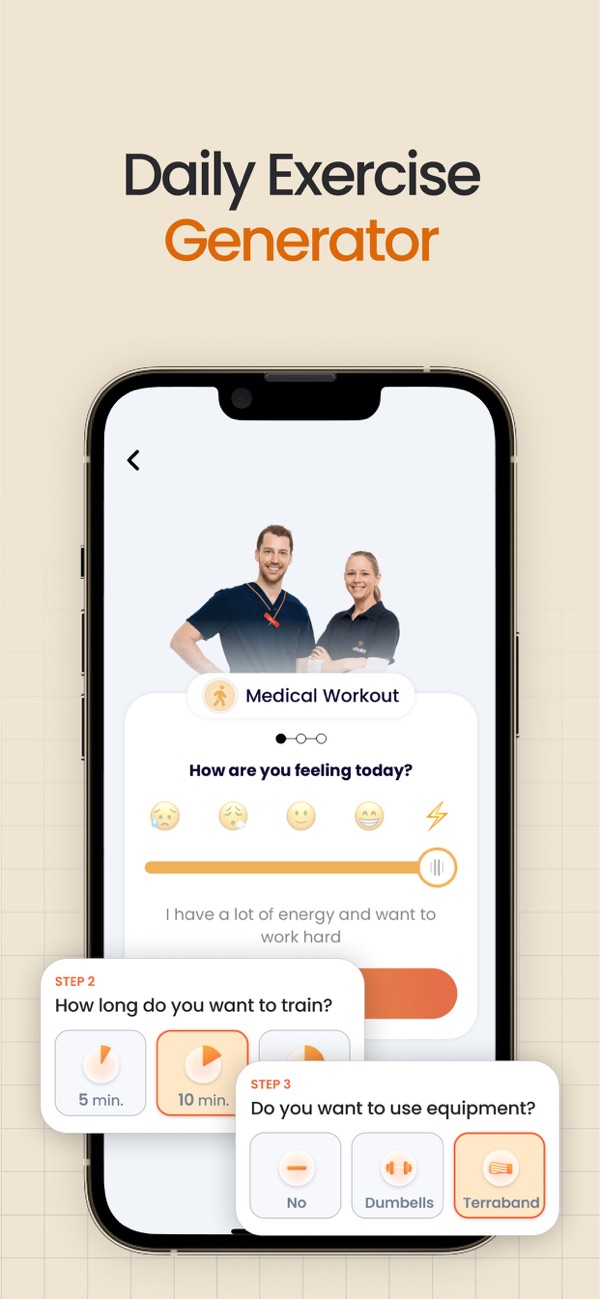
Ask how they feel, then build the session
With a chronic illness, energy changes daily, and a fixed session invites skipping the hard days. Three questions (feeling, time, equipment) shape the session, so a tired day becomes four short videos, not a missed one.
- Instead of
- The same session every day, or none
- Chose
- Three taps that fit the session to the day
Follow a video, not written steps
Every exercise is a video to copy, with a timer and the next exercise below. Afterwards the app asks for effort on the Borg scale and for pain, and both go to the clinician.
- Instead of
- Written steps and still images
- Chose
- A video to copy, a timer, two questions after
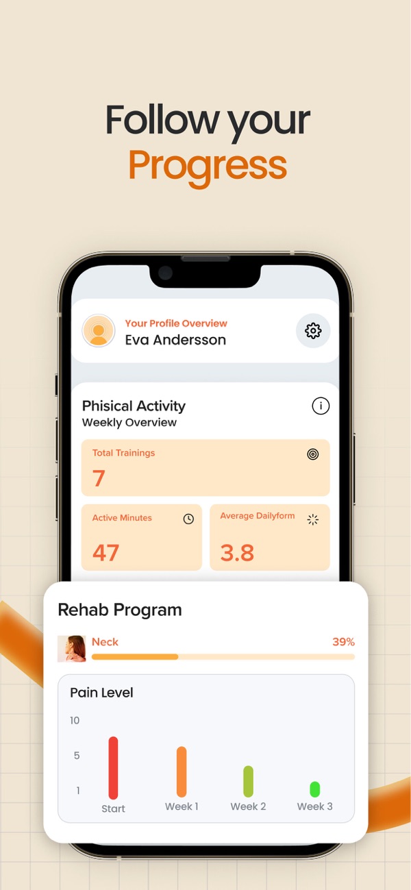
Progress shows if the pain is going down
What keeps these patients going is less pain. Progress puts training time next to the weekly pain score, and the clinician sees the same numbers.
- Instead of
- Activity stats on their own
- Chose
- Pain next to training, week by week
What the clinician sees
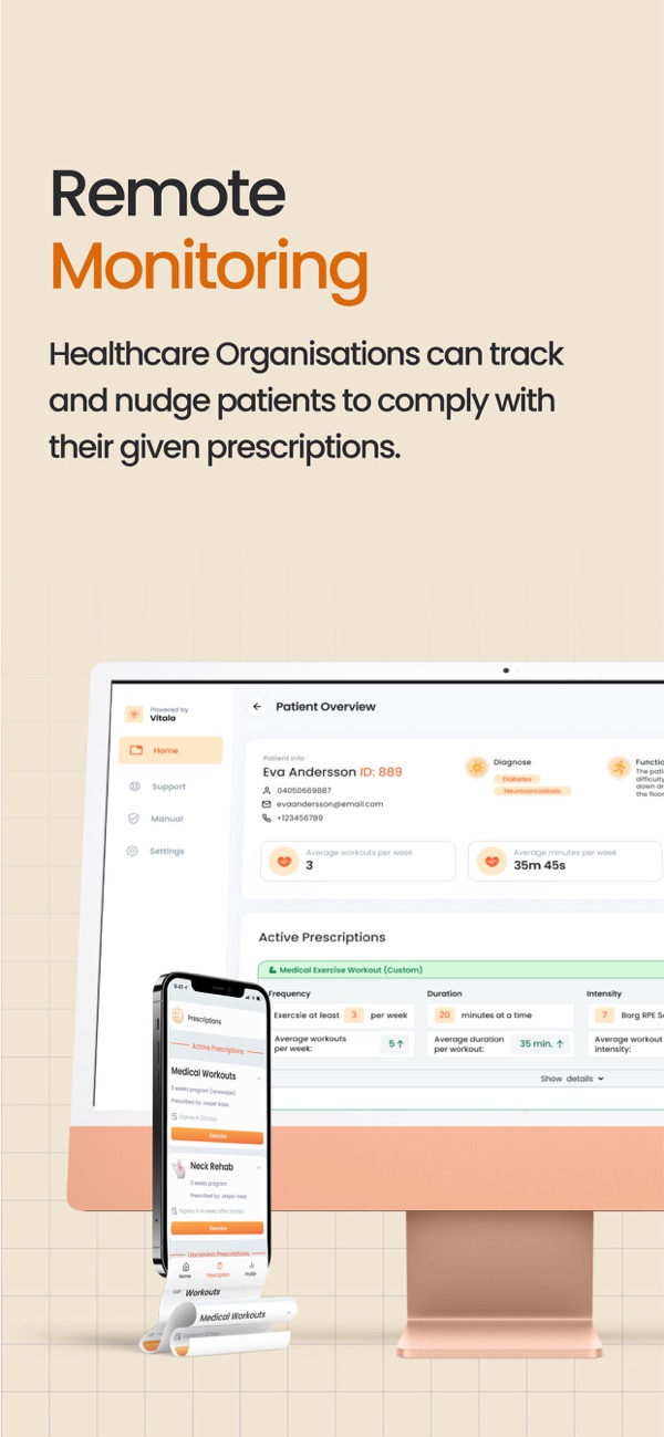
A clinician opens a patient to see if the program works: sessions done against the dose, pain and effort over time. Patients who need attention come first.
- Instead of
- A session log to read through
- Chose
- Planned next to actual, and who needs a look
| When | Session | Videos | Minutes | Effort | Pain | Eva’s note |
|---|---|---|---|---|---|---|
| Today 08:12 | Medical workout Gentle | 4 of 4 | 10 | 13 | 3 | Stiff at first, easier after |
| Thu 18:40 | Medical workout | 5 of 5 | 15 | 12 | 3 | No note |
| Wed 07:55 | Neck program | 3 of 3 | 8 | 11 | 3 | No note |
| Tue 19:10 | Medical workout Lighter | 3 of 4 | 6 | 10 | 4 | Tired after work |
| Mon 07:30 | Neck program | 3 of 3 | 8 | 12 | 4 | No note |
Change the dose, see it in the app
Clinicians think in doses, so the editor uses their terms: frequency, duration, Borg intensity and videos. A change reaches the patient’s app with a signed note.
- Instead of
- A workout builder in fitness terms
- Chose
- A dose in the clinician’s own terms, with a note
A pre-launch site with one job: sign-ups
Before launch the site had one goal, sign-ups for 30 free days: one headline, three steps, one form, in Swedish.
- Instead of
- A full product site before there was a product
- Chose
- One headline, three steps, one form
Bättre hälsa.
Aktivare liv.
Vitala är en medicinsk träningsapp som hjälper dig träna tryggt och effektivt.
Appen lanseras snart. Prova 30 dagar gratis.
Registrera dig härEnkla steg till ett vitalare liv
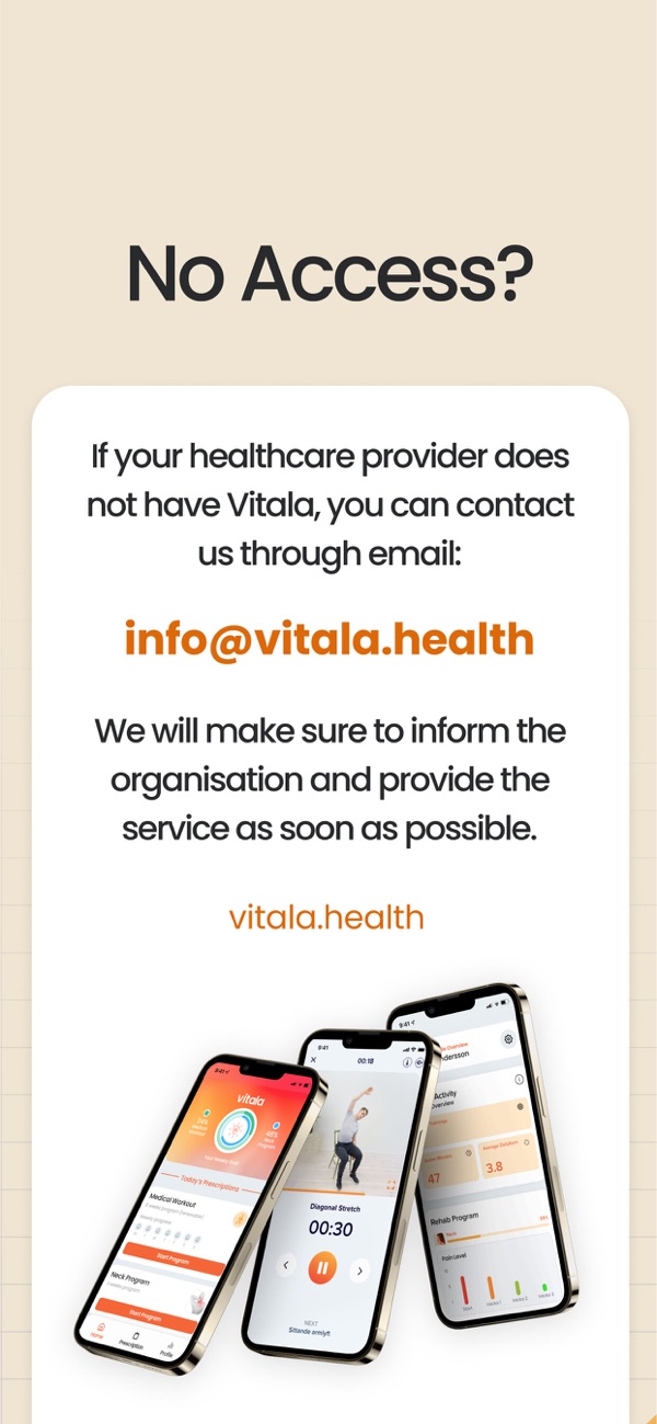
Straight from the App Store
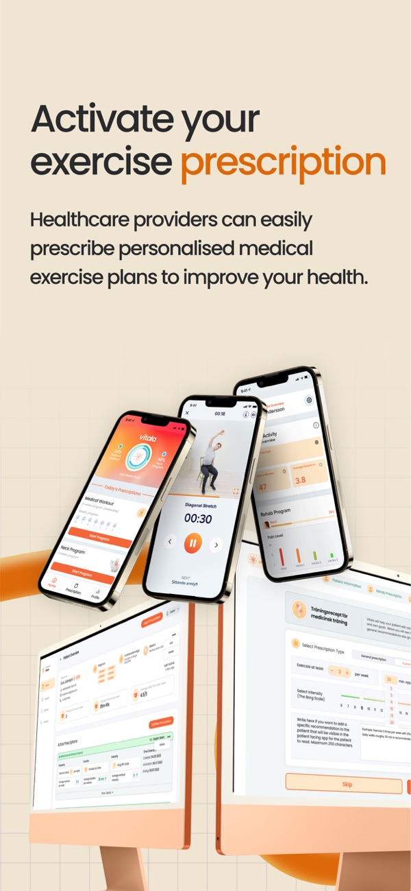
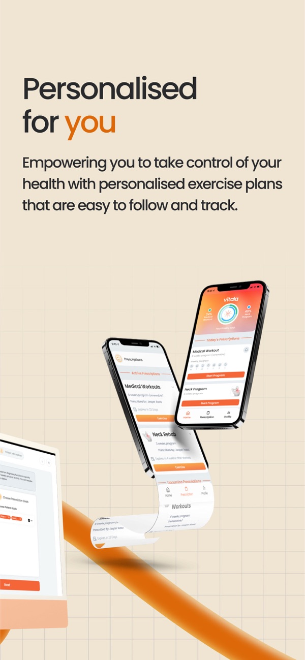
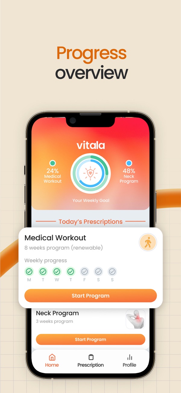
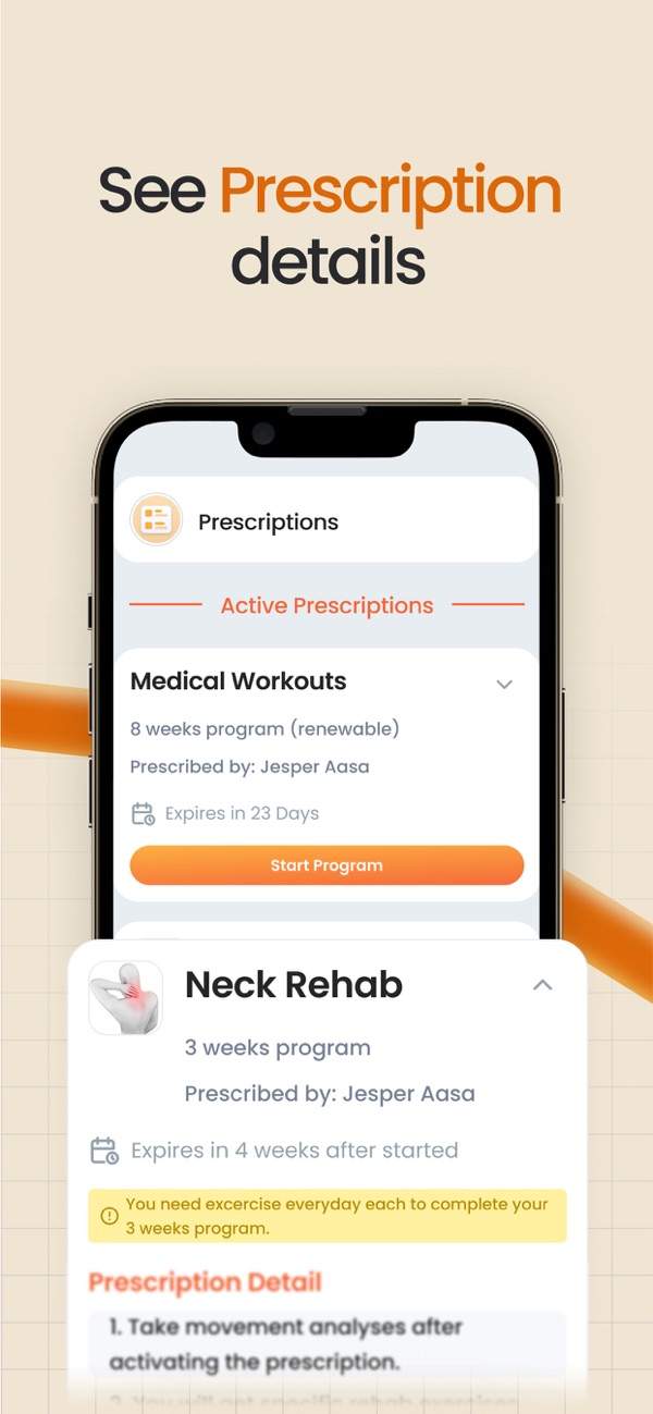
The brand
A sun, a shield and a heart: warm to a patient, safe to a clinic, legible at 16 pixels. One orange gradient carries the logo, the buttons and the header.

- Sun
#FFA646 - Orange
#F7833A - Coral
#FC503A - Cream
#F0E5D3 - Navy
#0F2B4C
Results
Live on the App Store and Google Play in September 2021. The logo still leads vitala.health. Since then Vitala has grown into a company of 30 people in six countries; that growth is the next team’s work.
How success would be measured
- AdherenceSessions done against sessions prescribed, per patient.
- Pain trendThe weekly pain score across a program.
- Clinician timeHow long it takes to review a patient and change a dose.
What I’d change
-
Home Every button shouts
Each program gets the same big orange Start. Which one first?
FixOne strong button for the next session, the rest quieter.
-
Progress Pain told by colour alone
Red to green bars, no numbers. Colour-blind users lose it.
FixPut the score on each bar.
-
Everywhere Typos reached the store
“Phisical”, “excercise” and “Exercsie” shipped in the screenshots.
FixA copy check before every release, in both languages.
Not mine: Vitala today: its new site, portal and six markets.
About the screens: rebuilt in HTML from the App Store listing and the 2021 site, partly filled in. Names and numbers are examples. Store images © Aasa Health AB.