Enterprise AI · Internal ML platform
MMP Lifecycle Manager
An internal platform for swapping a slow, costly outside AI model for a small in-house one. I designed it end to end so any engineer, not just a specialist, can translate the data, score candidates and train the replacement.
- Role
- Product designer, end to end
- Users
- ML engineers and their managers
- Made
- 8 screens, a status system and a design system
- Platform
- Web, as a Figma Make prototype
Every request made two paid calls to an outside model, and replacing it took four steps only a specialist could run.
I ordered eight screens like the work, blocked runs until they can succeed, and gave the manager one screen to approve on.
In the prototype’s projection: 98% cheaper, 23× faster, 24× the capacity. Projections, not measured results.
The problem
Getting there takes four dependent steps: translate the data, score candidates with a judge model, compare old and new, train the small model. The vocabulary is new and a manager must approve the switch, so it took a specialist.
- Asks
- “Where do I start?”
- Gets
- Three numbered steps, each one a link.
- Asks
- “What’s done? What’s stuck?”
- Gets
- A badge on every job, a status bar and shortcuts.
- Asks
- “Why should I say yes?”
- Gets
- One screen: how it works first, then how much.
My part
I designed it end to end, from the information architecture to the status system, as a working Figma Make prototype. The models behind it aren’t mine.
How a model moves through it
Four stages in the order of the work. The sidebar follows it, so the product teaches the process.
- 1TranslateDataset RepositoryEDS becomes IDS
- 2ScoreScoring ArenaA leaderboard by skill
- 3CompareDSv2 ComparisonThe manager says yes
- 4OptimiseOptimization LabDSv2 in Model Artifacts
- Screens
- 8One sidebar, in the order of the work
- Steps to start
- 3On the welcome card, each one a link
- Guarded runs
- 2Scoring and training can’t start half set up
Key decisions
The idea behind every decisionMake the wrong move impossible, not just discouraged, so any engineer can run what used to be a specialist’s job.
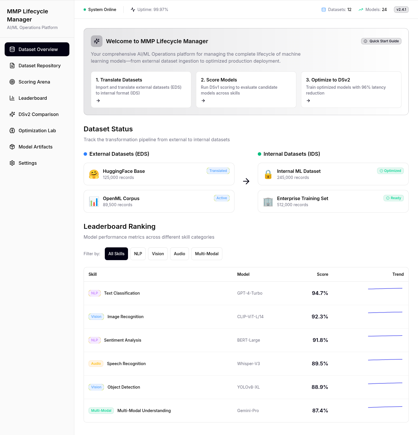
The first screen says what to do next
A new engineer meets eight screens and unfamiliar terms. The first screen shows three numbered steps, each linking to its screen, with every dataset’s status below.
- Instead of
- A product tour to click through
- Chose
- Three numbered steps, each one a link
| Skill | Model | Score | Trend |
|---|---|---|---|
| NLPText Classification | GPT-4-Turbo | 94.7% | |
| VisionImage Recognition | CLIP-ViT-L/14 | 92.3% | |
| NLPSentiment Analysis | BERT-Large | 91.8% | |
| AudioSpeech Recognition | Whisper-V3 | 89.5% |
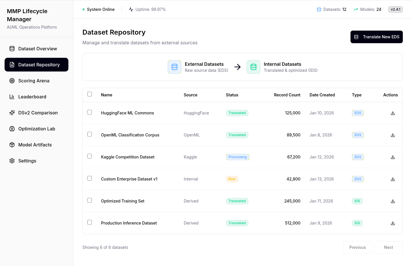
Every job’s status in one look
Translation jobs run for hours and get checked all day. Every row shows its state as a badge with a word in it, readable at a glance and not by colour alone.
- Instead of
- Opening each job to see its state
- Chose
- A badge with a word on every row
| Name | Source | Status | Records | Type | Actions | |
|---|---|---|---|---|---|---|
| HuggingFace ML Commons | HuggingFace | Translated | 125,000 | EDS | ||
| OpenML Classification Corpus | OpenML | Translated | 89,500 | EDS | ||
| Kaggle Competition Dataset | Kaggle | RawProcessingTranslated | 67,200 | EDS | ||
| Custom Enterprise Dataset v1 | Internal | RawProcessingTranslated | 42,800 | EDS | ||
| Optimized Training Set | Derived | Translated | 245,000 | IDS | ||
| Production Inference Dataset | Derived | Translated | 512,000 | IDS |
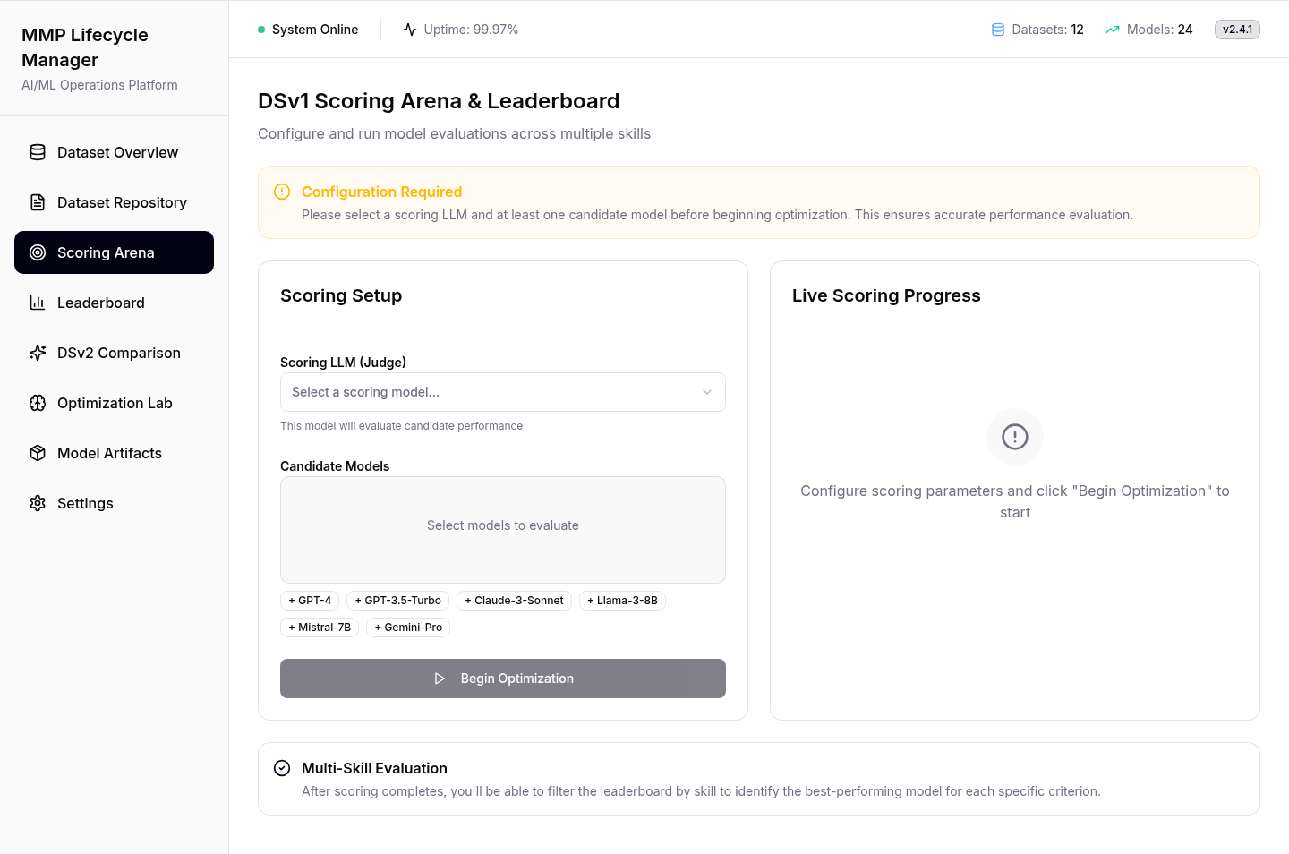
Start stays off until the run can work
The likeliest mistake is a run with no judge model, waiting for results that never come. So Start stays off while an amber banner names what’s missing.
- Instead of
- An error pop-up after the mistake
- Chose
- Start stays off until the run can work
A winner per skill, not one overall
A model can lead on text and trail on speech, so results rank per skill, with a trend on every row.
- Instead of
- One overall winner
- Chose
- A ranking per skill, a trend on every row
| # | Skill | Model | Score | Trend |
|---|---|---|---|---|
| 1 | NLPText Classification | GPT-4-Turbo | ||
| 2 | VisionImage Recognition | CLIP-ViT-L/14 | ||
| 3 | NLPSentiment Analysis | BERT-Large | ||
| 4 | AudioSpeech Recognition | Whisper-V3 | ||
| 5 | VisionObject Detection | YOLOv8-XL | ||
| 6 | Multi-ModalMulti-Modal Understanding | Gemini-Pro |
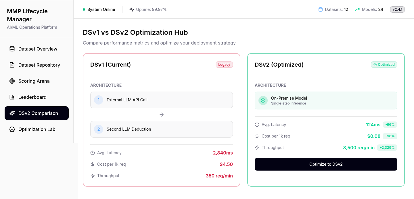
How it works first, then speed and cost
The manager approves the switch here. Current setup on the left, new on the right, each explained before its speed, cost and capacity, with the change beside every figure.
- Instead of
- A table of numbers to work out
- Chose
- Old next to new, how it works before how much
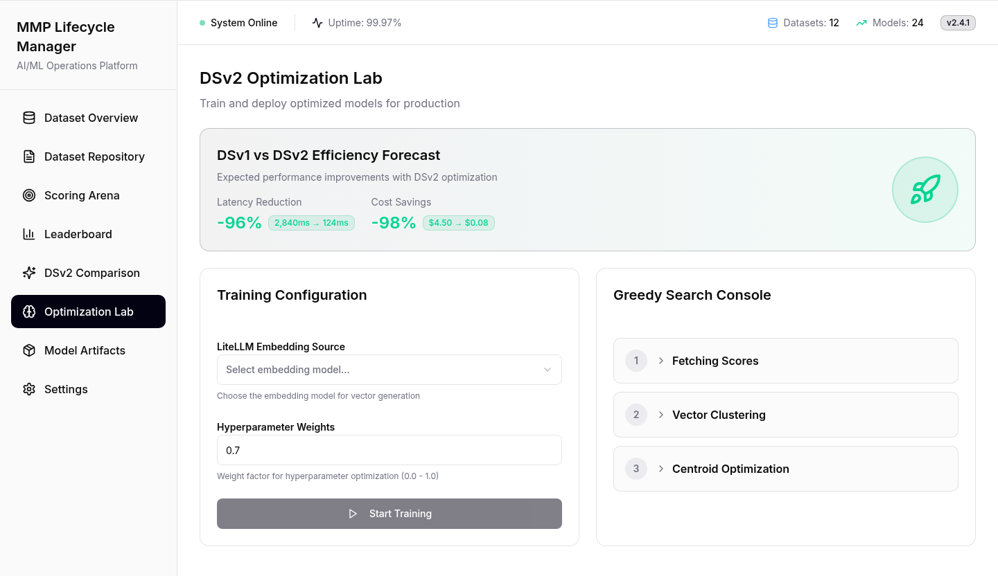
A long training run that never looks frozen
Training is the longest step. Start stays off until an embedding source is chosen, and the console names each stage, so a long job never looks stuck.
- Instead of
- A bare progress bar
- Chose
- Each training stage named as it runs
The last two screens reuse what you know
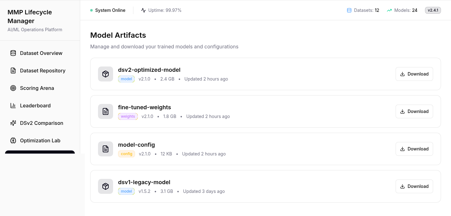
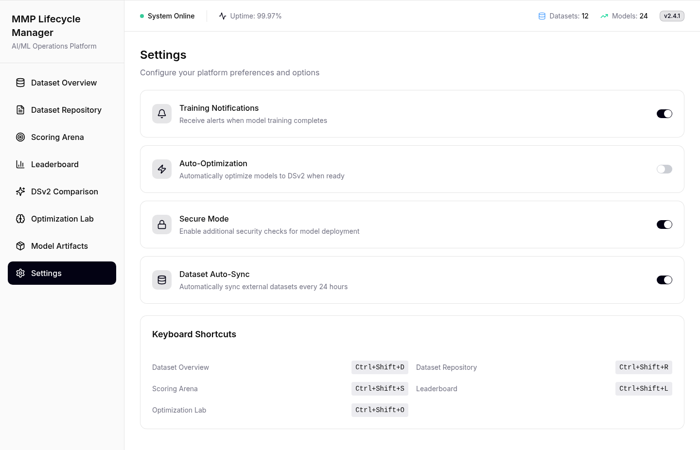
No new patterns here. Artifacts keeps the old model downloadable, and automatic optimisation stays off, so a person makes the final switch.
- Instead of
- Switching models automatically
- Chose
- Same patterns, and a person makes the switch
Straight from Figma Make
The original exports; the screens above are HTML rebuilds of them.
One system, eight screens
Every screen uses the same five pieces: learn one and you can read all eight.
Why it’s cheaper
The old setup calls an outside model twice per request; the new one answers once, in-house. Speeds are the prototype’s projections.
- 1RequestOne record
- 2Outside AI callStep 1, waits
- 3Second callStep 2, waits again
- 4AnswerFinally
- Speed
- 2,840msPer request
- Per 1k requests
- $4.50Paid to the outside model
- Capacity
- 350Requests a minute
- 1RequestOne record
- 2In-house modelOne step
- 3AnswerDone
- Speed
- 124ms−96%
- Per 1k requests
- $0.08−98%
- Capacity
- 8,500+2,329% a minute
Results
The prototype covers all eight screens in their real states. Its comparison projects cost from $4.50 to $0.08 per 1,000 requests, response from 2,840 ms to 124 ms and capacity from 350 to 8,500 a minute. Projections, not measured results.
How success would be measured
- First runTime for a new engineer to complete the lifecycle without help.
- Setup failuresRuns that fail because of missing setup. The guard should keep this at zero.
- Decision timeTime from a finished comparison to the manager’s approval.
What I’d change
-
Dataset Overview My colour rule broke on the first screen
“Translated” is blue on the Overview and green in the Repository. The one screen everyone sees first breaks the rule the rest depend on.
FixOne colour per state, set inside the badge component so a screen can’t override it.
-
DSv2 Comparison The old model shouldn’t be red
DSv1 still runs production today. Red says “broken”, and that’s unfair to the system the manager is being asked to replace.
FixGrey for today, green for new. Let the numbers make the case.
-
Scoring Arena The button names the wrong step
It says “Begin Optimization” on the scoring screen. Optimisation is the Lab’s job, two steps later.
Fix“Start scoring”, so each button says what it starts.
Not mine: the models behind the product. The company isn’t named.
About the screens: rebuilt in HTML from the Figma Make prototype; names and numbers are examples. Speed, cost and capacity come from the product’s own screen, unaudited.